Key Takeaways
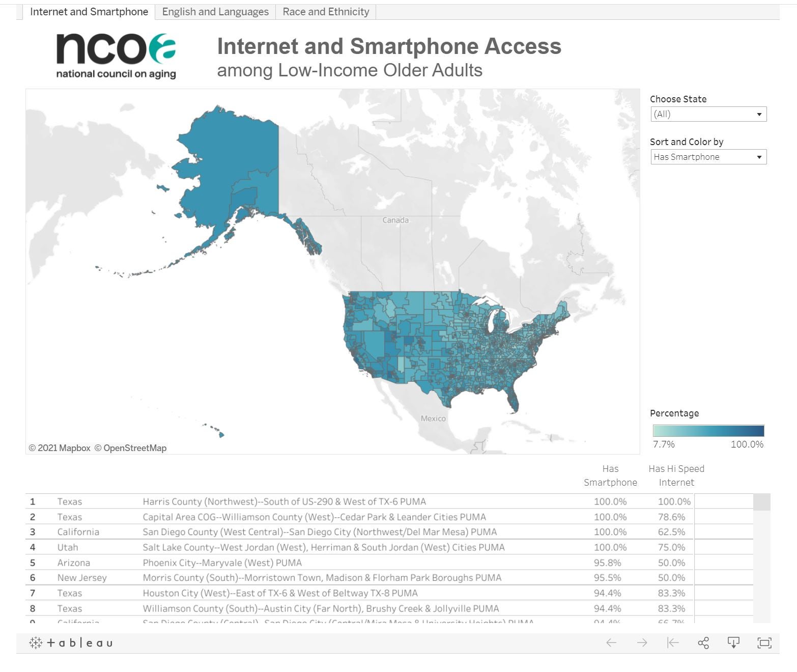
NCOA's new data visualization tool maps low-income older adults by race/ethnicity, access to technology, and limited English proficiency.
Use the map to identify needs among the low-income adults in your area, and to educate public officials about the demographics of older adults in your community.
Click on the picture of the map below or use this link to access NCOA's new tool.
The National Council on Aging (NCOA) has created this new data visualization tool to help professionals understand more about the characteristics of low-income older adults (age 60+ with incomes below 150% of the Federal Poverty Level) in their area . The data are from the 2019 American Community Survey, the most recent data available.
Click on the picture of the map or use this link to access the tool.
How to use the map
There are three tabs at the top of the map: Internet and Smartphone Access, English and Languages, and Race and Ethnicity. Watch the video below for a tutorial on how to navigate the tool.
Go to a tab – such as the one on internet and smartphone access – and select a state in the dropdown box on the right. You can sort and shade the map by either smartphone or high-speed internet to see where the highest and lowest rates of access exist within a state. The percentages are for adults age 60 and older with incomes below 150% FPL. Repeat this process for the other tabs with data on race/ethnicity and languages. There is a table at the bottom that allows for easy comparison of areas within a state.
Important notes
- The map may load slowly due to its large size.
- The geographic areas in the map are called Public Use Microdata Areas (PUMAs). PUMAs sometimes overlap with a county or counties in a state but sometimes do not. Each PUMA represents between 100,000 to 400,000 people, but most represent somewhere between 100,000 and 200,000. Large metros such as Los Angeles have multiple PUMAs. This allows you to narrow in on a specific area of a large metro. Because the PUMA size can vary, it is not possible to reliably convert the percentages into numbers of low-income older adults in a specific PUMA.
- While it is best to view the data within the map, it is possible to download the data by selecting the down arrow at the bottom right of the table. Select crosstab when downloading into either an Excel or csv spreadsheet. Note that you will need to manually add the headers to the columns in the downloaded data.
Reasons to use the map
This data visualization tool has a variety of applications to your work with older adults, including helping you consider how best to reach your audience (e.g., by translation, traditional print outreach, etc.) Use the map:
- To identify where there are the highest percentages of low-income older adults with Limited English Proficiency or whose native language is Spanish
- To identify where there are the highest percentages of low-income older adults without access to high-speed internet or smartphones
- To identify the percentage of low-income older adults by race/ethnicity in small geographic areas within a state
- To educate your local public officials about the demographics and needs of low-income older adults in your area
- To identify needs among low-income older adults in your area such as materials translated into Spanish or the percentage who need high-speed internet
- To help describe the population of low-income older adults in your service area when applying for funding
Data Source: 2019 American Community Survey retrieved via IPUMS USA, University of Minnesota, found on the internet at https://www.ipums.org/.


